Kore Identity
A challenger brand built to disrupt a category dominated by safe, corporate fitness brands.
The
Brief.
Kore Fitness was opening its first 5 locations and going up against established chains with 10× the marketing budget. Their only advantage was authenticity — a founder who was a former competitive athlete, a training methodology that actually worked, and a community of early members who were evangelical about the results. We had to turn that authenticity into a brand.
“The fitness category is full of brands that look the same — stock photography of perfect bodies, motivational platitudes, and a color palette that alternates between black/red and black/neon. Kore needed to look different without looking like it was trying to look different. The brand had to feel inevitable.”
Anti-Category Positioning
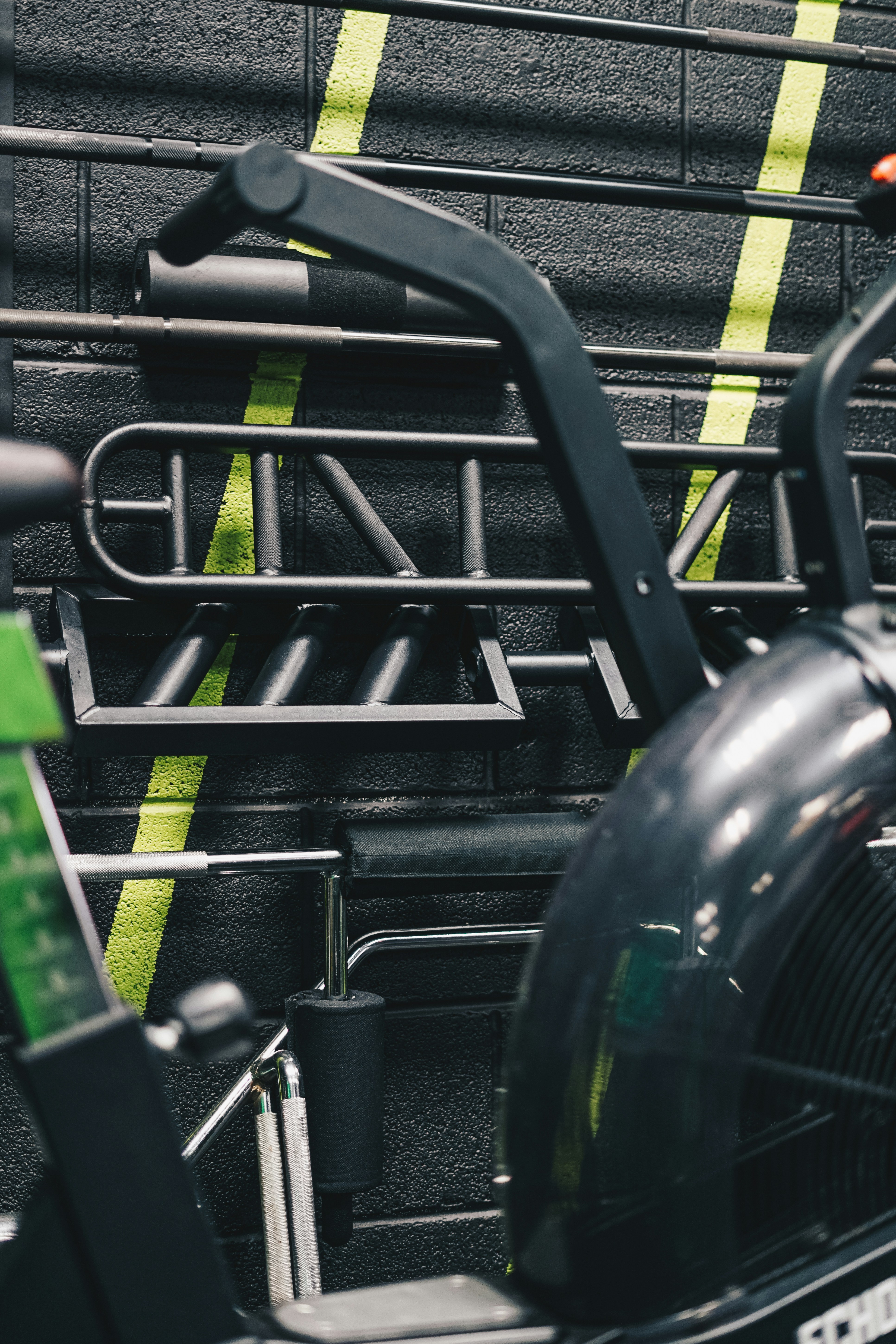
We started by mapping every visual convention in the fitness category — and then systematically broke each one. No stock photography. No motivational quotes. No gradient backgrounds. The Kore brand is built on restraint: black, white, and one accent color used sparingly.
Typography as Identity
The wordmark is the brand. We commissioned a custom typeface — a condensed grotesque with subtle imperfections that reference the physicality of training. The letterforms are tight, dense, and slightly uncomfortable. Like a good workout.
Environmental Design
The brand lives in physical space. We designed every touchpoint from the gym floor to the locker room — wayfinding, equipment branding, apparel, and a membership card that members actually want to show people.