Pulse Mobile App
200,000 downloads in 90 days. A 4.9-star rating. Here's how we built it.
The
Brief.
Pulse Health had a clinical-grade health tracking product that was losing users to consumer apps with inferior data but better UX. The science was there. The experience wasn't. They needed an app that could make complex biometric data feel intuitive — without dumbing it down for the users who actually cared about the numbers.
“Health data is inherently complex. Blood oxygen, HRV, sleep stages, recovery scores — the data is only useful if people understand it. The challenge was building an interface that could serve two very different users: the casual health-curious person who wants a simple daily score, and the performance athlete who wants to drill into every data point.”
Dual-Mode UX Architecture
We designed a single app with two modes — a simplified "Daily View" for casual users and an "Advanced View" for power users. The transition between modes is seamless, and the data is identical — only the presentation changes.
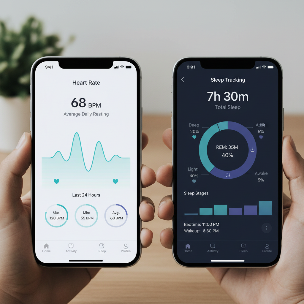
Data Visualization System
We built a custom chart library optimized for health data — not generic line charts, but purpose-built visualizations that communicate trends, anomalies, and context at a glance. Every chart was tested with real users before being built.
Performance Engineering
Health apps live or die on battery life and sync speed. We rebuilt the data sync architecture from scratch, reducing background battery drain by 60% and cutting sync time from 8 seconds to under 1 second.