Nova Brand System
Building a visual identity that scales across 12 markets without losing its soul.
The
Brief.
Nova Ventures came to us with a fragmented identity — six different logo variations, no consistent color story, and brand assets that looked different in every market. They were scaling fast and needed a system that could hold together across 12 countries, multiple product lines, and a team of 200+ people.
“The core tension: Nova wanted to feel premium and global, but their roots were scrappy and founder-led. Any rebrand that felt too corporate would alienate the early adopters who built the company. We had to find the line between polish and personality — and then build a system rigid enough to scale but flexible enough to breathe.”
Brand Archaeology
We spent the first two weeks interviewing 40 stakeholders across 6 markets — from the founding team to frontline sales reps. We mapped every touchpoint, collected every piece of existing collateral, and built a full audit of what was working and what was creating confusion.
Identity Architecture
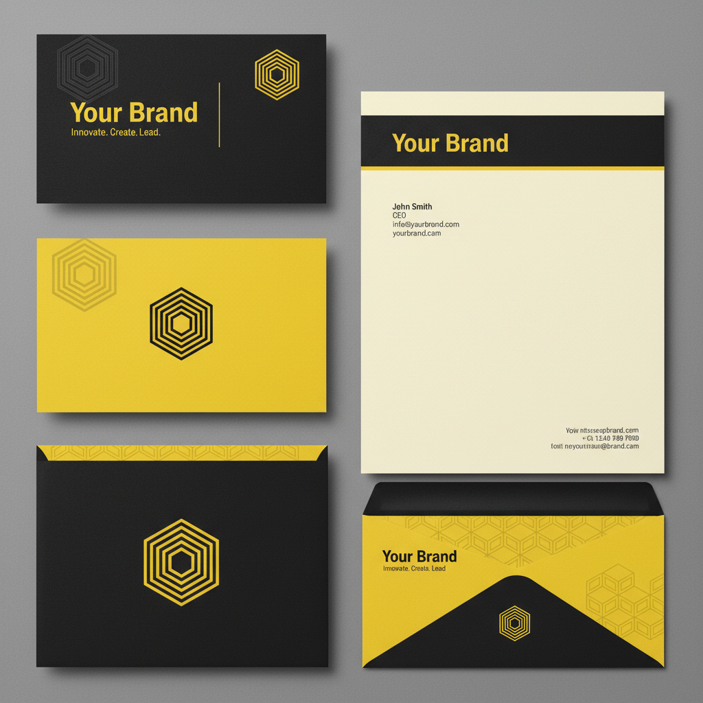
Rather than designing a single logo, we designed a system. A primary mark, a wordmark, a symbol, and a set of motion primitives that could be recombined across contexts. The color palette was built with accessibility at its core — every combination passes WCAG AA.
Motion Identity
Static brand systems break down in digital environments. We built a motion language — easing curves, transition speeds, animation principles — that gave the brand a consistent feel whether it was a loading screen or a product launch film.